 FEATURED
Embracing Change and Building Momentum: The New Era of BlueAlly
At BlueAlly, we stand at a pivotal moment in our journey – a time that transcends mere reflection, urging us to embrace the present and actively shape our future.
So much has changed recently at BlueAlly. The past year has been a testament to this evolution, marked by multiple acquisitions and the arrival of new team members, each bringing fresh perspectives and vibrant energy.
We stand as a company more unified and capable than ever before and upon reflecting on that change, realize now is the time to redefine BlueAlly.
The Transformation of BlueAlly
As we punctuate this transformative era, now is the time to tell our story. Through an evolved brand identity, we unveil the new BlueAlly with our manifesto video.
A Palette of Progress
Our new color scheme features a deeper blue, symbolizing strength, and maturity, alongside a lighter blue representing insight and clarity. The addition of a tertiary green breathes renewal and growth into our visual identity, reflecting our commitment to continuous progress.
Our New Identity
– The Flywheel:
Our visual identity is inspired by Jim Collins’, the renowned author of Good to Great, who describes the concept of the flywheel in a business to mean a powerful state where the various aspects of a company feed into one another, creating a momentum that continuously builds upon itself. Imagine a heavy mechanical wheel that takes great effort to get moving, but once it gets turning, its weight and speed continue to build momentum, making it increasingly difficult to stop.
Much like the mechanical flywheel uses its own weight and speed to build momentum and maintain energy in a system, so too does a business need a flywheel comprised of technology, systems, and great people to propel it forward. This notion resonated with our leadership team, looking at BlueAlly as an entity that both seeks to achieve a flywheel for its own success but one that enables its clients to do the same.
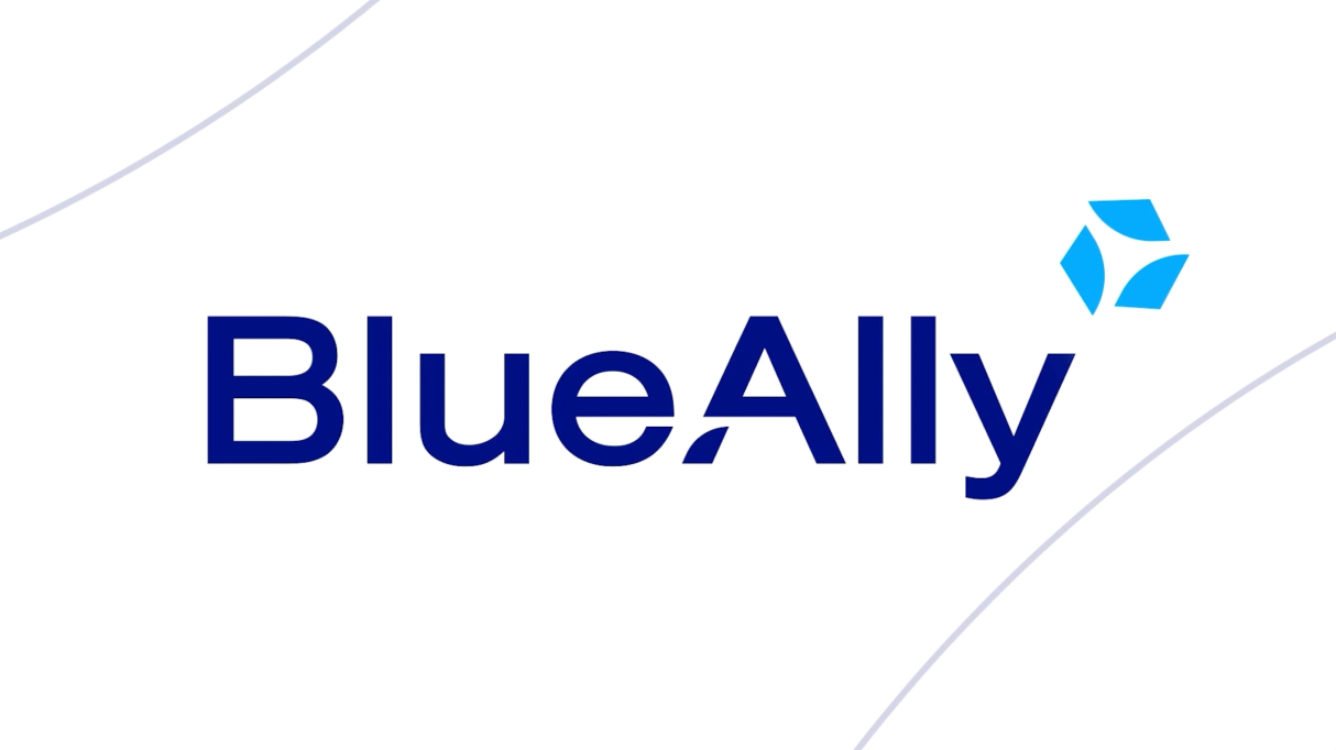
Our rebrand culminates in the creation of a new logo, which we proudly call the “Flywheel.” It is an emblem of relentless effort, symbolizing the reinvigoration of our team, igniting the momentum of the Flywheel, and embodying the depth, energy, and focus with which BlueAlly propels itself and its clients to greater heights.
Core Values and the Flywheel:
The Flywheel is composed of three “blades,” each representing a core value of BlueAlly:
The blades of our Flywheel are not perfectly aligned, symbolizing the complexity that our clients face, and the mindset that our approach to problem-solving will always be multifaceted and tailored to their needs.
If we wanted a symbol that represented a simple environment, we would have chosen a circle. Rather we have irregular shapes, perfectly arranged to form a new more powerful shape, symbolizing how we create multi-dimensional solutions to complex problems.
The negative space within the Flywheel forms a forward-pointing arrow, encapsulating our drive to propel clients to new levels of confidence and capability.
Our People Are
Our Catalyst
The ‘A’ of our BlueAlly wordmark contains a supporting piece that mirrors the blades of the Flywheel. This final blade is the catalyst that kickstarts our Flywheel – the first big push that allows momentum to build and progress – our people. We believe that our key differentiator is the quality of our people.
The Flywheel as a Mindset
As much as the Flywheel is about BlueAlly and what we are building for ourselves, the concept applies equally to our clients and their businesses. Our clients come to us because they want us to help get their business moving and create lasting success. They, too, want to continue improving so that their efforts compound and build an increased forward-driving momentum.
In this way, the Flywheel becomes our guide, a rationale, establishing an outlook and a mindset that focusses us on generating business outcomes for our clients. We are reminded that what our clients truly seek, is not the technology itself, but the possibilities that emerge from our creation of solutions. If we get this right, we will enable our clients to achieve the ultimate outcome – a business flywheel of their own.
Revealing Simplicity
Within the Complexity
Hidden within the flywheel, amongst the dynamic motion of the blades, is one of the simplest and strongest shapes – the triangle. The triangle lies at an angle to create a forward-pointing arrow, conveying momentum and our commitment to helping clients achieve success. This hidden triangle, though visible in the negative space, drives us to our core mission, to do what our clients look to us for, which is to reveal simplicity amongst the complexity.
When we began this rebranding journey, we conducted extensive research with our clients to understand what it’s like to be in their shoes. The common theme that arose was a feeling of uncertainty, of being overwhelmed by the pace of technology, the number of choices, and the multiple ways of achieving the same thing. BlueAlly exists to alleviate these feelings of uncertainty, making technology more accessible, certain, and impactful for every organization. We strongly believe that Conquer Complexity is a strong and bold, yet simple message that will resonate deeply with our clients.
Trade IT complexity for capability with
solutions that elevate possibility.
This rebrand is an incredibly exciting time for all of us at BlueAlly, as well as for our clients. The new BlueAlly stands as a united force, making technology accessible and impactful. We are eager to deliver on our promise, ingrained within the Flywheel, and to continue executing on our mission of empowering clients to achieve sustained growth and success, with a renewed energy and focus.
We hope that you join us in our enthusiasm as we embark on this journey, shaping a new legacy of BlueAlly.
BlueAlly. Conquer Complexity.
Have any questions about our rebrand? Send me a message.
Jonathan Berger
Senior Vice President, Digital Strategy


